Design, concept and space
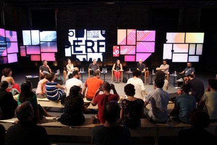
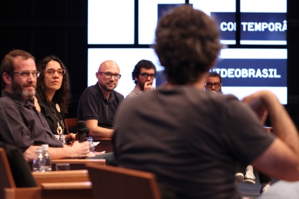
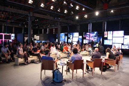
In the final panel of Focus 2, Design, concept and space, the designers Kiko Farkas, Bill Martinez, and the duos Celso Longo & Daniel Trench, Angela Detanico & Rafael Lain, discussed the creative process leading to the visual identity of Festival Sesc_Videobrasil throughout its thirty years.
The creator of two different visual identities for the festival, including the first edition, Kiko Farkas discussed the technological changes that have taken place in graphical creation. “Posters used to be the basic piece, but not anymore. What you have now is not a picture, but rather a landscape.” Farkas also recounts that in the first edition, focusing on video, “the idea was for there to be a reflection about content as well. The creative process for the posters related to the creative process for the videos themselves.”
After a moment when technological development was the main issue in video aesthetics and graphical creation, he now sees a similar trend to that of the festival’s first edition, where documentary issues with political overtones prevail again. “I get the feeling that what matters is to show what mainstream media doesn’t,” says Farkas, ascribing this fact to technological development itself, which has turned the technological and digital mediums as part of daily life.
Bill Martinez, the creator of the visual identity for the third edition, succeeded Farkas, said that in the 1980s, creating the festival’s identity meant creating a poster. “There was no graphic computing, there was just computing,” he says.
Daniel Trench, one of the creators of the visual identity for the current edition, said “the idea was not to disrupt, to create something new, but rather to strive for a relationship of continuity with regard to the festival, and to come up with two identities, seeing as the ongoing edition features two different projects, the 30 Years show and the Southern Panoramas Competitive Show.” Celso Longo, a partner of Trench’s, added: “we have tried to do something simpler, something harder, something that related to the previous identities created by Rafael Lain and Angela Detanico” “We were thinking of creating an environment that had a sort of neutrality to it, an attempt to create a semantics which related more closely to this edition,” he says. The other point in their proposal was to use the space at Sesc Pompeia, which Longo describes as one of São Paulo’s architectural jewels. “The idea was to take up the space in a different way, using its architecture and relating to it, in such a simple way that it was almost dry,” Longo explained.
Rafael Lain, who has created the visual identities from the 13th to the 17th alongside Angela Detanico, outlined the duo’s creative process through animations, in a counterpoint to Kiko Farkas’ yet-handmade India ink posters, reflecting the changes in design. The duo’s work sought to integrate the concepts of the curated program through an investigation based on typography and semantics, designed to be used in different mediums, such as vignettes, the website, and the pieces in the exhibition itself. “Videobrasil offers the possibility for the design to be integrated into thefestival itself, and thus it ends up reflecting the evolution and the changes undergone by the institution itself,” said Angela.
The Festival’s creator and curator, Solange said she is unable to think of Videobrasil unless she is engaged in a constant exchange with the designers, whose work begins up to one year prior to the next edition. “The design is integrated with the curating work, and as such it is a part of this process, reflecting the festival’s concept,” she says.


